
Case study 3 of 4 · La Redoute app · iOS & Android
Making sign-up short enough to finish
La Redoute’s app asked new customers for 8 required fields on a single page, including their address and number of children. I moved most of that data collection to later, more relevant moments, tested the new flow with users and shipped it with the app team.
- 35.8% →64.6%Account creation completion rate after release
- +45%First-time successful sign-ups
- 8 →5Required fields
Problem
A sign-up form that took 5 minutes to fill in
Logged-in customers matter to La Redoute: they can be recognised, receive personalised offers and come back to their basket. Yet in Q1 2023, only 35.8% of the people who started creating an account in the app finished.
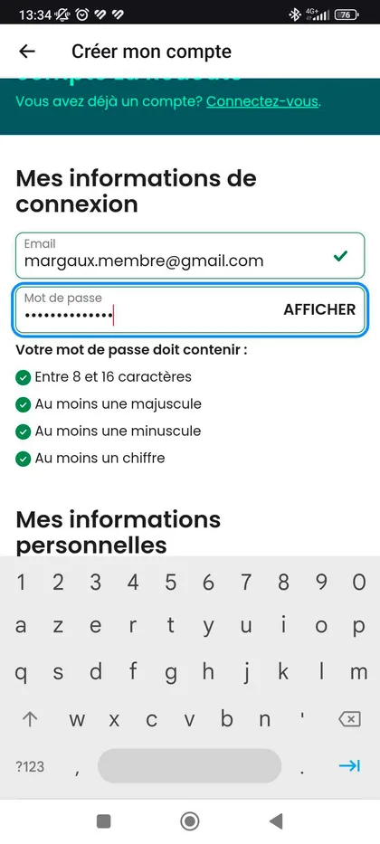
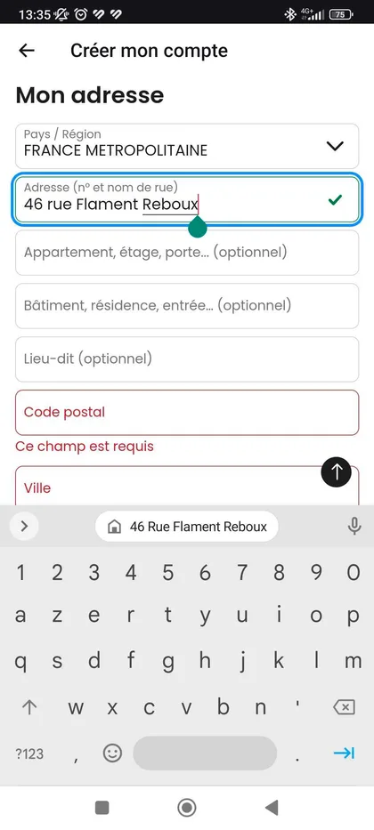
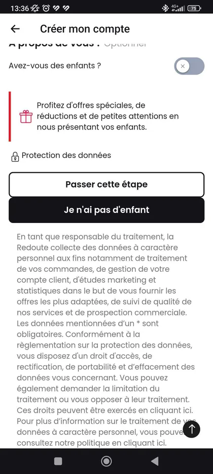
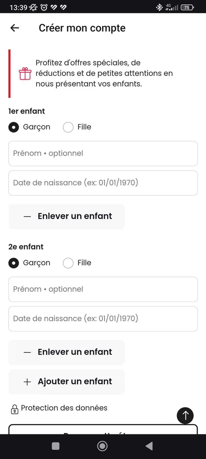
The flow asked for a large amount of information on one page: delivery address, date of birth, number of children and more. A standard sign-up form takes about 2 minutes. Ours took about 5.
Discovery
Finding where people dropped off
I started with three sources before drawing anything:
- An audit of every step, listing friction points and usability issues.
- Analytics: completion rates and behaviour at each step, to locate the bottlenecks.
- A benchmark of competitors and best-in-class apps, to see which patterns users already expect.
The diagnosis was clear: we were asking for information we did not need at that moment.
Strategy
Three objectives, two constraints
I framed the project around objectives the whole team could check designs against, and named the constraints early so the plan stayed realistic.
Objectives
- Simplify sign-upCollect data in context, later in the journey, and add shortcuts such as magic-link sign-in.
- Reduce abandonmentMake each step feel personal and easy to understand.
- Make a good first impressionFor many customers, sign-up is their first conversation with La Redoute, so the tone should be warm and conversational.
Constraints
- Other teams rely on this dataSome fields feed Marketing and other departments. Moving them had to be balanced against their needs.
- An audience aged 25 to 44The largest groups in the app are 25–34 (29%) and 35–44 (26%), so any new pattern needed clear onboarding.
Design
Key decisions
Move data collection to the moment it is useful
- Why
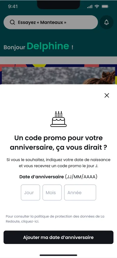
- Address, date of birth and family details made sign-up long, but customers only need them later, for example at delivery.
- Trade-off
- Marketing uses this data. I worked with the Marketing team to decide which fields could move to more contextual touchpoints without hurting business performance.
- Result
- Required fields went from 8 to 5.
Split the form into three short steps
- Why
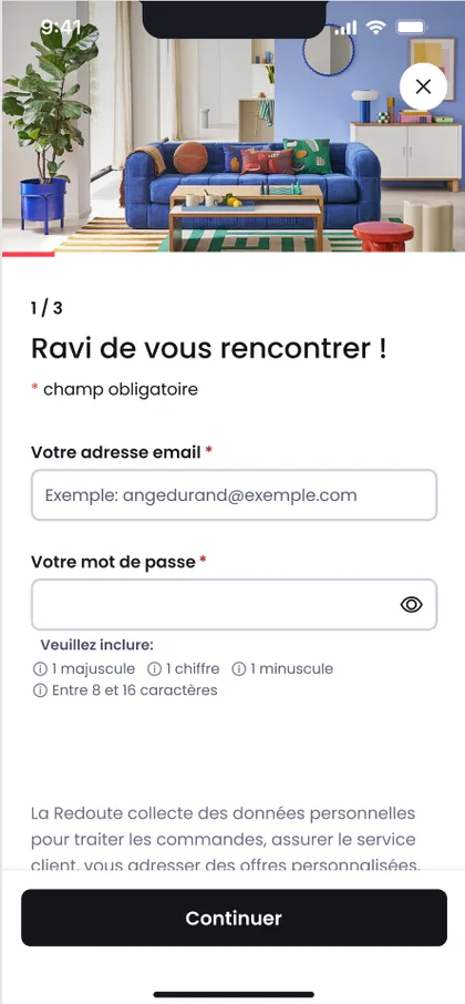
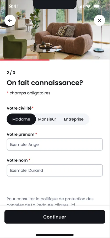
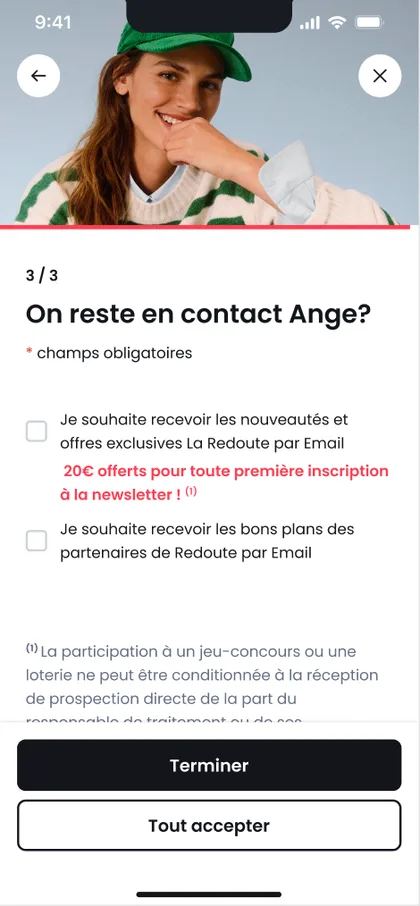
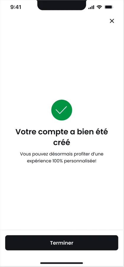
- One long page felt like a chore. Three steps (email and password, then identity, then communication preferences) show progress and ask for less at once.
- Detail
- Each step has a friendly heading, such as “Ravi de vous rencontrer !”, in line with the conversational tone objective.
Design every edge case, not only the happy path
- Why
- Developers and QA need to know what happens when things go wrong.
- Detail
- The specification covers an existing email (clear message plus a login button), technical errors, a failed account check, and loading and disabled states for each button.
User testing
What users told us, and what I changed
I ran moderated interviews with 6 users on a prototype of the new flow, watching where they hesitated and asking them to explain what they understood at each step.
Anything that was not understood, I changed before the flow went to development.
Delivery
Shipping it with the app team
Once stakeholders had validated the flow, the Product Owner, the Technical Project Manager and I split the journey into smaller pieces so it could be prioritised in the roadmap.
With the PO and the Conversion team, we agreed on the KPIs that would tell us whether it worked. I stayed close to QA and the iOS and Android developers until release.
Outcome
Almost twice as many people finished sign-up
After the first release, the completion rate reached 64.6%, well above the key result we had set. First-time successful sign-ups rose by 45%. Most other metrics improved too.
After release
One metric dropped, so we tested why
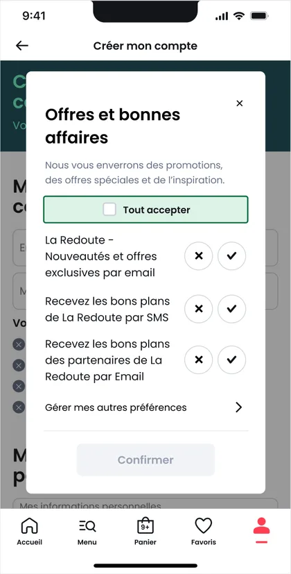
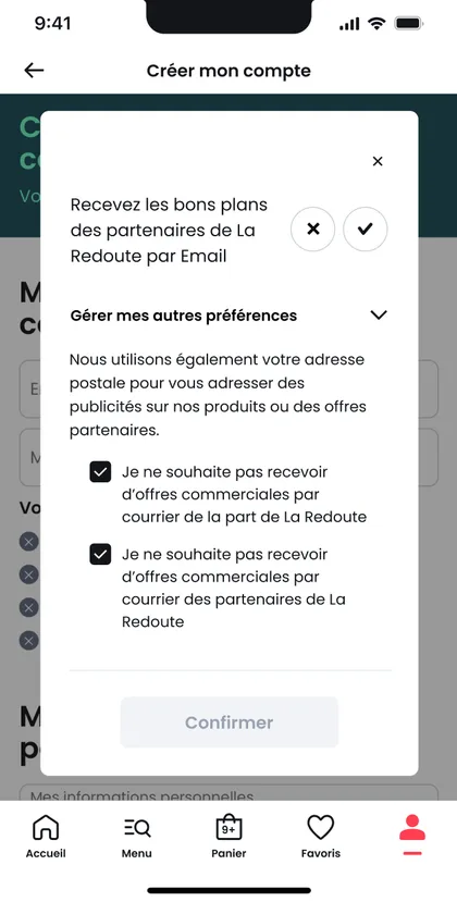
One metric went down: newsletter opt-ins. We suspected the new checkbox design and ran an A/B test on that component alone.
The alternative version kept account creation stable and raised both opt-in rates. The redesign itself was not the problem: one component was.
| Account creation | Newsletter opt-in | Partner opt-in | |
|---|---|---|---|
| Original | 87.49% | 66.4% | 30.07% |
| Variant A | 87.91% | 71.75% (+8%) | 47.02% (+56.4%) |