
Case study 4 of 4 · La Redoute app · iOS & Android
Turning a homepage users ignored into a useful starting point
The La Redoute app homepage had high bounce rates: users saw it as a marketing page and skipped it. Behind it, several teams built its content with rigid templates and no shared rules. I redesigned the page as a set of modular widgets, and gave the teams who fill it the guidelines and training to use them well.
- +30%Click-through rate on homepage cards
- +28%Sessions scrolling beyond 50% of the page
- +8%Average time spent on the homepage
Problem
A user problem and a business problem
For users
The homepage was seen as a marketing page rather than a useful entry point into the app, so most users ignored it.
For the business
The homepage is where personalised offers and the marketing calendar reach customers. Teams needed guidance on personalisation and a fix for the process issues around the widgets.


Discovery
Looking at the page, the market and the people behind it
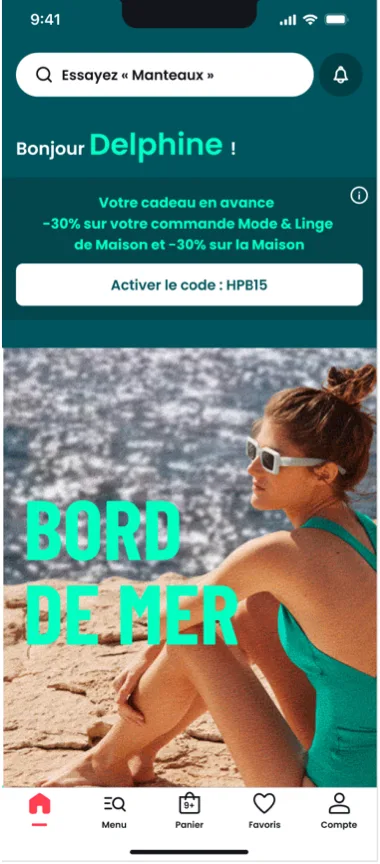
Before touching the UI, I looked at how the homepage performed, at design patterns in other retail apps, and at how the page was actually produced, from the Marketing teams to the Graphic Design department.
What I found:
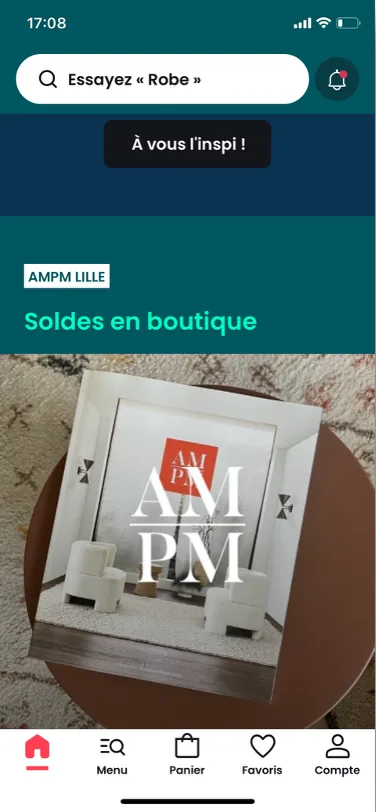
- Widgets were not modular, so teams repurposed templates for things they were not designed for.
- Governance was unclear and production was rarely planned ahead, which led to inconsistent results.
- Some brand colours caused accessibility issues, and the CMS gave its users almost no guidance.
With the UX Research team, I then ran user tests to understand what people need when they land on the homepage.
- User testsThe top of the page worksNotifications, promo codes and shortcuts were appreciated. The rest felt repetitive or irrelevant to some.
- User testsLow desire to scrollFor some tasks, such as tracking an order, users never scroll.
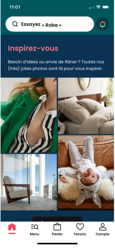
- User testsPersonalisation is noticedUsers who already had the app recognised it through the greeting and recommendations.
- BenchmarkCalm structure, varied rhythmH&M, IKEA and Tikamoon use shortcuts and a restrained structure even with colourful brands.
Strategy
Three pillars to judge every design against
- Pillar 1Show the personalisationMake the recommendations built by Marketing visible and relevant.
- Pillar 2Balance brand and accessibilityKeep La Redoute’s identity while fixing contrast issues caused by some brand colours.
- Pillar 3Modular, flexible widgetsTemplates that serve several purposes instead of one use case each.
Design
Widgets with options, and limits
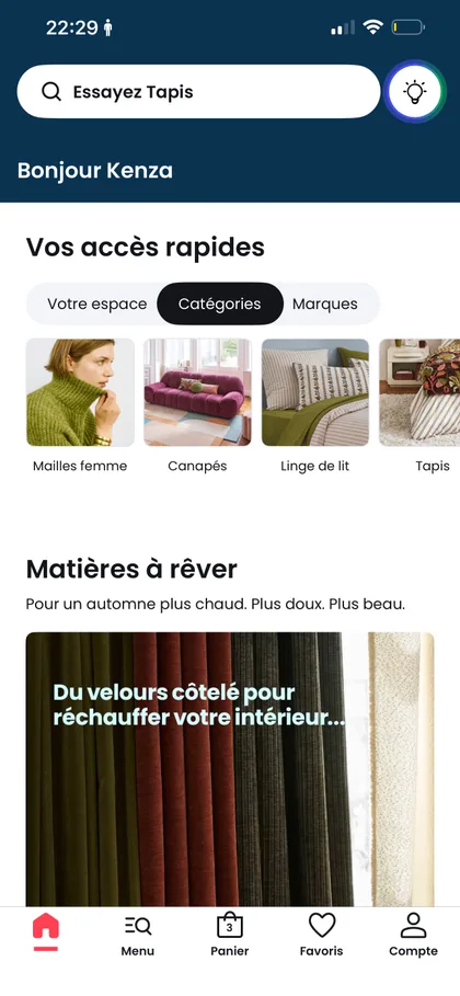
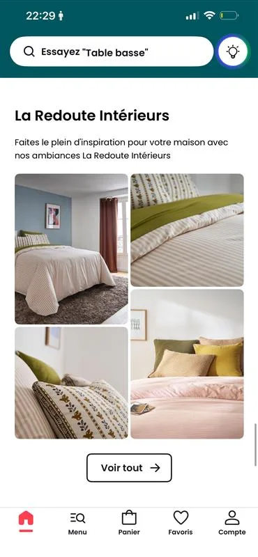
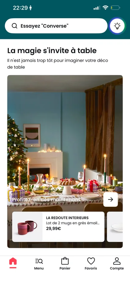
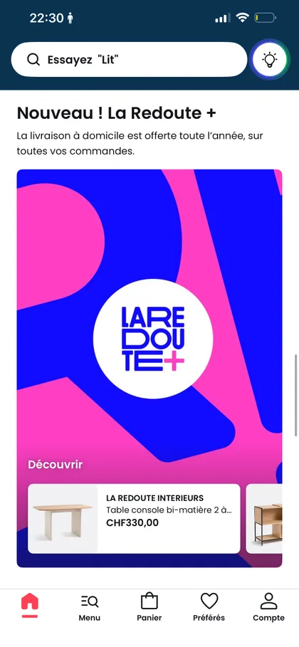
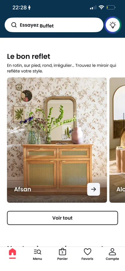
Options that can be switched on or off in the CMS
- Why
- Modularity gives Marketing the flexibility it was missing, without new templates for every campaign.
- Trade-off
- Too many options overload the people configuring the page and lead back to inconsistent results. I addressed this with guidelines rather than by removing flexibility.
Rules built into the widgets
- Why
- Accessibility and consistency should not depend on each campaign.
- Detail
- Character limits for titles and buttons, text only in black or white, opacity rules for backgrounds, and guidance on which images keep text readable.
Guidelines & training
Designing for the teams who use the system
A widget system only works if the people filling it use it well. I wrote detailed guidelines and trained the Marketing and Graphic Design teams, in France and internationally.
They cover the design principles, the common pitfalls and the configurations to avoid, so the homepage stays consistent and easy to use whoever builds it.
Delivery
Phased with the app team
With the Product Owner and the Technical Project Manager, I split the work into phases so it could be prioritised in the roadmap. Together with the Conversion team, we defined the KPIs that would measure success, and I worked with QA and developers through implementation. The new homepage went live in the app in February 2024.
Outcome
People started using the homepage
After release, the click-through rate on homepage cards rose by 30%, sessions scrolling past half of the page rose by 28%, and the average time spent on the homepage rose by 8%.