
Case study 1 of 4 · La Redoute app · iOS & Android
Bringing the product page up to standard, then testing what comes next
The product page is where La Redoute customers decide to buy, and it had not been redesigned in years. I split the work in two: first bring the page up to market standards based on data, then experiment with new features, including AI, through A/B tests.
- +12%Conversion rate
- −15%Bounce rate
- +9%LaRedoute+ loyalty programme activation
Problem
The page that decides the sale was out of date
As part of a wider revamp of the app’s key flows, we turned to the product page. It is the central conversion touchpoint: customers need to find everything they need there to decide with confidence. It had not been redesigned in several years, and many stakeholders depend on it.
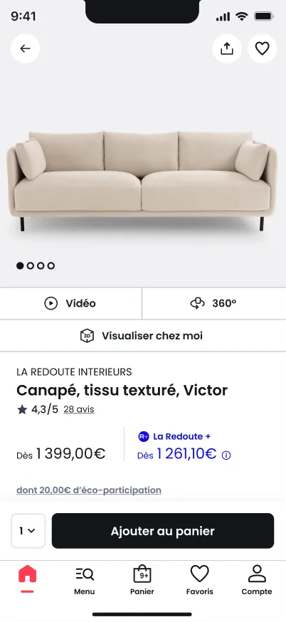
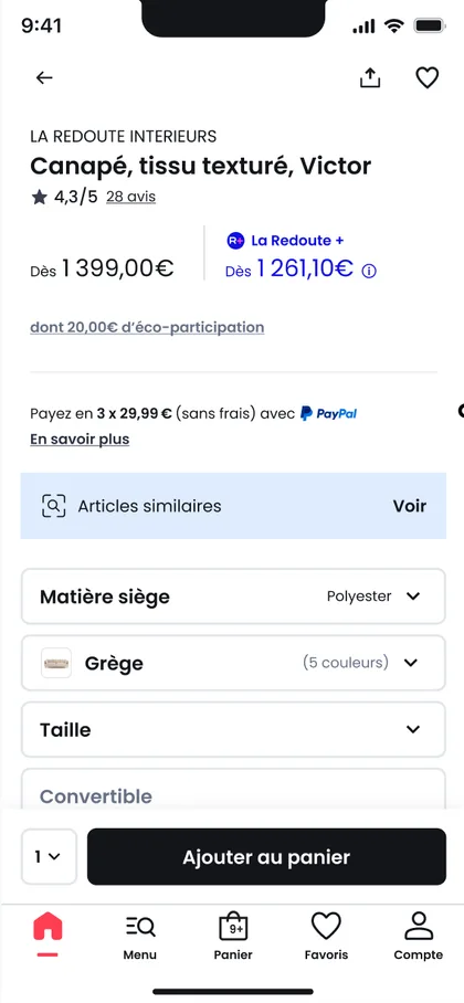
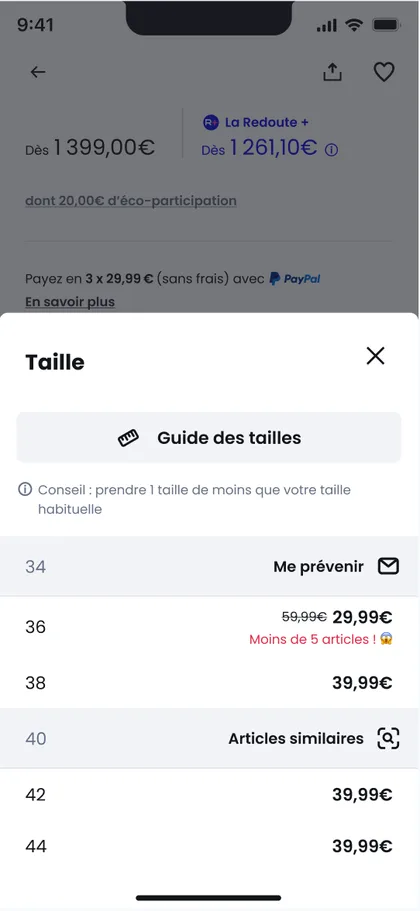

Discovery
What the data said about how people use the page
I gathered business requirements, user feedback and existing analytics, then mapped every zone of the page to what we knew about it.
- 95%of user interactions happen in the picture zone.
- 13–24%of mobile users scroll down to the product description (16.6% on desktop).
- 2.6×customers view a product 2.6 times on average before adding it to the basket, 3.4 times before buying.
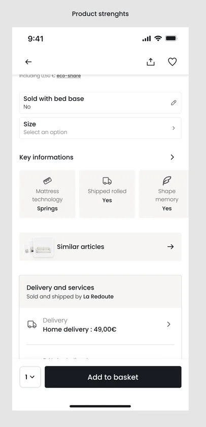
This shaped the priorities: the images had to do most of the work, key information had to sit higher on the page, and the add-to-basket button had to stay reachable. User feedback also showed that the page felt messy and too long, and 40% of users found the discount mechanics confusing.
Phase 1: redesign
Market standards first, innovation second
Split the project into two phases
- Why
- The page had to catch up with market standards before new ideas could be tested fairly. A first phase streamlined the interface and made it feel more premium. A second phase explores new features.
- Also
- At the same time, the developers were rebuilding the page in SwiftUI and Jetpack Compose. That refactoring was a big piece of work on its own, so phasing the design kept each release manageable for the team.
- Trade-off
- Fewer new features in the first release, in exchange for a stable base to measure them against.
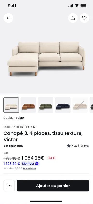
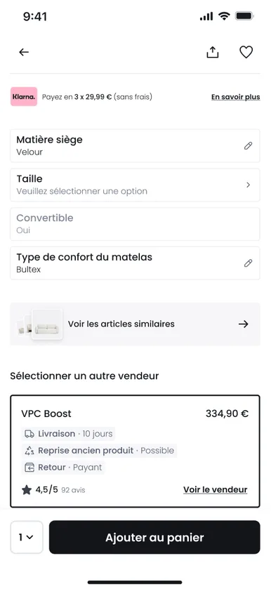
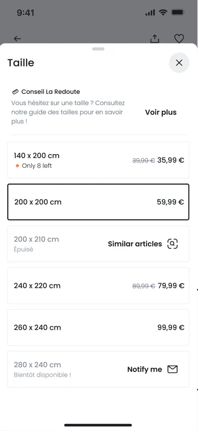
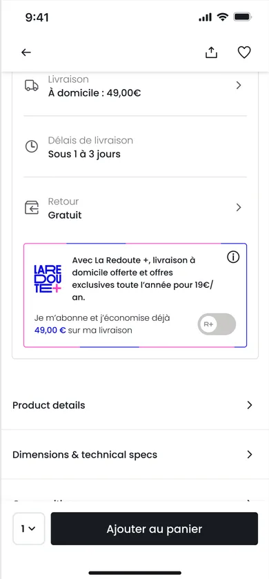

With the Product Owner and the Technical Project Manager, I split the journey into smaller pieces to prioritise in the roadmap, and worked with QA and developers through implementation. With the PO and the Conversion team, we set the KPIs before release.
Outcome
More conversions, fewer bounces
Since phase 1 went into production in April 2026, the conversion rate has risen by 12%, the bounce rate has fallen by 15%, and activation of the LaRedoute+ loyalty programme has risen by 9%.
Phase 2: new features
Phase 2: exploring new features
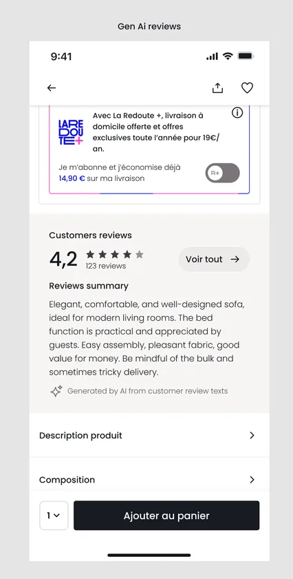
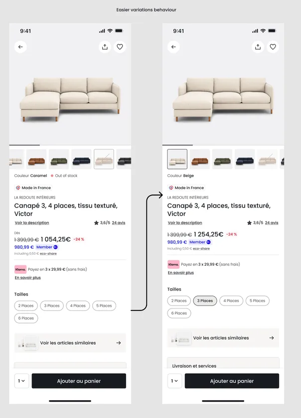
With the core of the page redesigned, the next step was to explore new features, several of them powered by AI, such as a summary of customer reviews.
Most of them are tested through A/B tests to measure their effect on behaviour and performance before any wider rollout.
Vision
Shaping where the product page goes next
With the Product Owners, I ran a series of workshops to explore a more forward-looking product page. The ideas include AI virtual fitting, room simulation for furniture and dynamic recommendations. The vision is still in discovery, and we have started validating some key features.